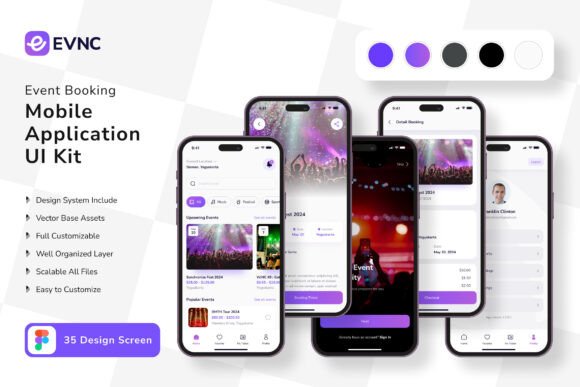
Event Booking App Mobile UI KIT: Build Smarter, Faster, and Without Unnecessary Headaches
If you have ever tried to design a mobile app from scratch, you already know how quickly small decisions turn into big delays. Spacing feels off. Buttons feel inconsistent. Screens that should connect smoothly end up looking like they belong to separate projects. That is exactly where a well-structured UI kit changes everything. The Event Booking App Mobile UI KIT offers a streamlined starting point: 35 pixel-perfect screen designs, 80 UI elements, 100 vector layers, and full editability inside Figma. But owning a quality template is only half the story. Using it well requires avoiding a few common missteps that even experienced designers sometimes make.
What the Event Booking App Mobile UI KIT Actually Gives You
Before diving into mistakes, it helps to understand what this kit contains and why it matters. The kit is built around real-world event booking flows—think ticket selection, calendar views, confirmation screens, user profiles, and payment interfaces. Every screen is designed at pixel level, which means spacing, typography, and alignment are already handled. The 80 UI elements cover everything from input fields to navigation bars, and the 100 vector layers give you scalable graphics that do not break when you resize them. Symbol objects let you reuse components across screens without rebuilding them each time. And because everything is fully layered and editable in Figma, you can adjust colors, text, and layout to match your brand without wrestling with locked files.
The free font and included vector icons further reduce the friction of sourcing assets separately. But here is the important part: the demo images you see in previews are not part of the download. That is a common point of confusion, and it leads to the first mistake.
Mistake One: Assuming Demo Images Are Included
It is easy to fall in love with a preview screenshot. The carefully styled photos, the polished illustrations, the lifestyle imagery that makes the app feel alive. When you open the Figma file and find placeholder gray boxes instead, disappointment can set in. This is not a flaw of the kit. It is standard practice across virtually all UI templates. The preview images are there to show context and mood, but licensing restrictions prevent them from being distributed.
What to do instead: Plan for your own imagery from the start. If you are building an event booking app, gather real or stock photos that match your use case—concert venues, conference halls, ticket stubs, or user avatars. Replace the placeholders early in your workflow so you can evaluate how the final app will look with actual content. This also helps you spot any contrast or readability issues that might hide behind polished demo graphics.
Mistake Two: Diving Into Customization Without Exploring the Full Kit
When you open a file with 35 screens and 80 elements, it is tempting to jump straight into editing the one screen you need right now. That rush often leads to duplicated work. You might spend time building a custom button style, only to discover later that the kit already includes a symbol object for that exact button. Or you might tweak colors on one screen manually, then realize every other screen still uses the original palette.
A better approach: Spend 20 to 30 minutes simply exploring the file. Open each main screen. Note which elements are symbols, which text layers are linked to styles, and how the component hierarchy is structured. Understanding the system before you change it saves hours later. Because the kit uses fully layered objects and symbol instances, editing one symbol updates every instance across all screens. That is the kind of efficiency you lose when you work outside the template's logic.
Mistake Three: Overlooking the Value of 100 Vector Layers
Vector scalability might sound like a technical detail, but it affects your everyday workflow. When you export assets for different screen sizes—phones, tablets, and even foldable devices—raster images degrade while vectors stay crisp. The 100 vector layers in this kit cover icons, illustrations, dividers, background shapes, and decorative elements. If you treat them as static images rather than editable vectors, you miss the chance to resize, recolor, or restructure them without losing quality.
Practical advice: Use Figma's vector editing tools to adapt illustrations to your brand. Change stroke widths, adjust corner radii, or combine two vector shapes into a new icon. This flexibility is especially valuable if your app targets multiple platforms or needs dark mode variants. Vectors cut your asset generation time significantly compared to exporting and re-importing PNGs.
Mistake Four: Ignoring the Symbol Objects Workflow
Symbols are the backbone of efficient UI design. The kit includes symbol objects for items like navigation bars, ticket cards, date pickers, and action buttons. Each symbol can have multiple variants—for example, a button that appears in primary, secondary, and disabled states. Beginners sometimes detach symbols to make quick changes, which breaks the link to the master component. Later, when they update the master, those detached instances stay outdated.
How to avoid this: Learn to override symbol properties instead of detaching them. In Figma, you can change text, swap icons, or toggle visibility within an instance while keeping the connection alive. If you need a completely different structure, create a new component from scratch rather than breaking an existing one. This discipline ensures that a single update propagates across all 35 screens, keeping your file consistent without manual repetition.
Mistake Five: Neglecting Color Style Setup Before Building Screens
The kit uses a default color palette that may not match your brand. Changing colors one layer at a time is tedious and error-prone. You will inevitably miss a shadow, a stroke, or a background fill, resulting in a mismatched interface. Worse, if you change your mind later, you have to hunt down every instance again.
Correct workflow: Set up your color styles in Figma before you start modifying screens. Map the kit's existing colors to your brand palette using the local styles panel. Because the kit is fully layered and text styles are free to edit, you can reassign colors globally in minutes. This also works for typography: adjust the free font to your preferred typeface and update text styles once. Every screen that uses those styles will update automatically. This step alone transforms a generic template into a branded product without manual rework on each screen.
Mistake Six: Underestimating the 80 UI Elements as Just Parts
Eighty UI elements might sound like plenty, but they are not meant to be a fixed library. They are a starting point. Some designers treat the kit as a closed set and force their ideas into whatever elements exist. That leads to awkward layouts or missing functionality. Others ignore the provided elements entirely and build their own from scratch, defeating the purpose of the template.
A balanced strategy: Use the supplied elements as building blocks, but combine and adapt them freely. Need a search filter that does not exist as a single component? Combine an input field, a dropdown symbol, and a button from the existing set. Want a card layout with a different information hierarchy? Duplicate an existing card component and rearrange the text layers. The kit's strength is that every element is independent and editable, so you can mix, match, and extend without fighting the design system.
Mistake Seven: Forgetting That 35 Screens Cover a Flow, Not a Final Product
Thirty-five screens is a generous starting point, but an event booking app in production often requires more: onboarding screens, password reset flows, confirmation emails (in-app), notification settings, multiple language variants, or accessibility toggles. Relying only on the included screens and calling the project finished creates a gap between the prototype and a shippable app.
What experienced builders do: Use the kit as a structural template. Map the included screens to your core user journey—browse events, select a date, choose tickets, checkout, confirmation, profile. Then identify missing screens and build them by following the same grid, spacing, and component patterns established in the kit. Because the design language is already defined, your new screens will blend seamlessly. This approach saves design time while still producing a complete product.
Mistake Eight: Assuming Pixel-Perfect Means No Need for Testing
Pixel-perfect screen designs ensure that every element aligns to a consistent grid and spacing rhythm. That is a huge time saver. But it does not guarantee that your app will work well on every device size, that text will fit in all languages, or that touch targets meet accessibility guidelines. Design files are not interactive prototypes. What looks balanced on a Figma artboard may feel cramped on an iPhone SE or too sparse on a tablet.
How to stay ahead: After customizing the kit, create a quick interactive prototype in Figma to test navigation flow. Share it with a few people who match your target audience and watch where they hesitate. Also, review your screens against platform guidelines—especially button sizes, contrast ratios, and hit areas. The kit gives you a clean foundation, but real-world usability still depends on testing and iteration.
Mistake Nine: Overlooking the Value of Free Font and Icon Vector License
The kit includes a free font and free icon vectors, which is a nice bonus. But free does not always mean unrestricted. Some free fonts limit commercial use, require attribution, or only cover a single weight. Similarly, free icons may have different licenses for modification versus redistribution. Assuming you can do whatever you want without checking can cause legal headaches later.
Simple precaution: Review the license terms for both the font and icons included with the kit. If you plan to sell the app or distribute it publicly, ensure the license covers commercial use. If the license is too restrictive, swap in an alternative open-source font like Inter or Noto Sans, and replace icons with a library like Material Design or Font Awesome. The kit's structure makes substitution straightforward, and this step protects you from future issues.
Mistake Ten: Rushing to Download Without Evaluating Fit
Before you buy or download any UI kit, it pays to ask: do these 35 screens match the user flow I need? The Event Booking App Mobile UI KIT is tailored for events—ticketing, scheduling, and discovery. If your project is a fitness booking app or a restaurant reservation system, the core structure may still work with customization, but you should check whether the included elements cover your specific touchpoints. A mismatch means more rework and less value from the template.
Smart approach: Read the product description carefully and look at all preview images. Count how many screens align with your required features. If you see ticket selection, date picking, and confirmation flows, you are in good shape. If your app needs complex recurring event logic or team management dashboards, you may need to plan extra customization time. Knowing this upfront helps you set realistic expectations and decide whether this kit saves you enough work to justify the investment.
Building a mobile app is hard enough without fighting your design tools. The Event Booking App Mobile UI KIT gives you a polished, editable, and scalable foundation that removes thousands of repetitive decisions. But a template is only as effective as the workflow you apply to it. By avoiding the common mistakes outlined here—ignoring symbols, skipping style setup, misjudging asset licenses, or rushing past the preview images limitation—you turn a good starting point into a genuinely faster path to launch. Take the time to explore the full kit, customize it with discipline, test with real users, and fill in the gaps methodically. Your future self, staring at a consistent app that actually works, will thank you.