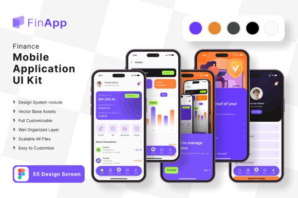
FinApp Finance App Mobile UI KIT
Building a mobile application from scratch can be a time-intensive process, especially when you care about design quality and user experience. The FinApp Finance App Mobile UI KIT offers a practical shortcut. It provides a complete set of pre-designed screens and elements that let you skip the early design grind and jump straight to building a polished finance app. Whether you are a solo entrepreneur testing an idea or a seasoned developer working under a tight deadline, this kit aims to simplify your workflow without sacrificing visual appeal.
What the FinApp Finance App Mobile UI KIT Actually Includes
The kit is built around 55 pixel-perfect screen designs covering common finance app flows. You get 80 UI elements, 100 scalable vector layers, and a free font to maintain consistency. Because everything is fully layered and available in Figma, you can adjust colors, resize components, and rearrange layouts without starting from scratch. The vector objects remain sharp at any screen size, which matters when you test on different devices. All images in the previews are placeholders—you receive the editable vectors and layers, not the stock photography.
For someone building a budgeting app, a personal finance tracker, or a mobile banking proof of concept, these screens reduce the gap between idea and a working prototype. The same logic applies if you are working on a coffee shop loyalty app or a similar service-oriented mobile interface. The Core Coffee Shop App Mobile UI KIT follows a comparable structure, also offering 55 templates, 80 UI elements, and full Figma editability. Both kits share a common philosophy: give you ready-made building blocks so you can focus on functionality and branding rather than reinventing common layouts.
Why Different Audiences Find Value in a Finance UI Kit
People approach UI kits with different priorities. A beginner may care most about ease of use and learning how professional apps are structured. An experienced designer might prioritize flexibility and the ability to customize quickly. A business owner evaluating the kit wants to know if it reduces time to market and how much it costs compared to hiring a designer. Understanding these differences helps you decide whether the FinApp Finance App Mobile UI KIT fits your specific situation.
Beginners and Hobbyists
If you are new to app design or development, this kit acts as a guided template. You can open the Figma file, see how screens are organized, and learn by tweaking existing elements. The symbol objects and fully layered structure let you change a color scheme or replace icons without breaking the overall layout. For a hobbyist building a simple expense tracker for personal use, the 55 screens may feel overwhelming at first. However, you can start with just a handful of core screens—like the dashboard, transaction list, and account summary—and ignore the rest until you need them. The free vector icons and font remove the extra step of sourcing assets, so you can concentrate on understanding how navigation and data display work in a real app context.
Freelancers and Designers
Freelancers handling client projects often face tight budgets and short timelines. The FinApp Finance App Mobile UI KIT gives you a head start. Instead of building every screen from wireframes, you can present the templates to a client and discuss modifications. If the client wants a coffee shop loyalty app instead of a finance app, the principles transfer. The Core Coffee Shop App Mobile UI KIT covers similar ground, so you can choose the kit that matches the project vertical. The 100 scalable vectors and 80 UI elements mean you have enough variety to propose two or three visual directions without designing each one separately. For designers who value speed and reliability, having a library of tested screen layouts reduces the risk of overlooking a common user flow during the early design phase.
Small Business Owners and Entrepreneurs
Launching a mobile product as a small business owner involves weighing cost against potential return. Hiring a designer to create a custom finance app interface can cost thousands of dollars before you even test your concept. A UI kit like FinApp lets you build a prototype for a fraction of that investment. You can customize the screens in Figma to match your brand colors and typography, then use that prototype to validate the idea with early users or investors. The kit’s long-term usefulness depends on your willingness to adapt it. If you plan to evolve the app over several years, you might eventually outgrow the pre-built templates. But for the initial launch and the first rounds of user feedback, the kit offers a practical balance between quality and cost. Entrepreneurs evaluating the Core Coffee Shop App kit can apply the same logic when building a loyalty or ordering app.
Educators and Creators
If you teach mobile design or development, a ready-made UI kit can serve as a classroom resource. Students can study the 55 screens to understand how real finance apps handle states like empty lists, loading screens, and error messages. The editable Figma file lets you assign exercises where learners modify the color style or replace icon sets to match a fictional brand. For creators producing tutorials or online courses, the kit provides a consistent visual language to demonstrate design principles without spending hours creating assets. The free font and vector layers reduce licensing complications, so both educators and learners can focus on the concepts rather than tool limitations.
Practical Examples of Using the Kit
Imagine you want to build a personal finance app that tracks spending by category. You open the FinApp Finance App Mobile UI KIT and find pre-built dashboard screens with pie charts, transaction rows, and account cards. You remove two of the default chart elements and add a monthly comparison graph using the existing vector shapes. The color style change takes a few minutes because all interface elements use shared layer styles in Figma. Within a few hours, you have a prototype that looks complete enough to test with five friends. Their feedback on navigation and terminology helps you refine the flow before you write any backend code.
Now consider a coffee shop owner who wants a mobile ordering and rewards app. The Core Coffee Shop App Mobile UI KIT includes menu screens, order status pages, and loyalty card displays. You replace the placeholder product images with real photos of your menu items. You adjust the primary color to match your shop’s branding. The 55 templates cover most scenarios a coffee shop app needs, from onboarding to payment confirmation. Because both kits follow a similar structure, you can even combine elements if you want a finance-style dashboard for the shop’s daily sales reports. The flexibility of the layered Figma file makes these cross-kit integrations possible without causing layout conflicts.
Evaluating Quality, Reliability, and Learning Value
Quality in a UI kit comes down to how well the screens match real-world usability standards. The FinApp Finance App Mobile UI KIT includes pixel-perfect designs, which means spacing, alignment, and typography are consistent across all 55 screens. The 100 scalable vectors ensure that icons and illustrations remain crisp whether you view them on a phone or a tablet. Reliability matters when you import the kit into your workflow. Because the files are fully layered and organized with symbol objects, you can update a master component and see changes ripple through every screen. This structure saves time during iteration and reduces the chance of missing a revision. For someone prioritizing learning value, studying how the screens handle different states teaches you patterns you can reuse in future projects. The combination of a finance kit and a coffee shop kit shows how the same design principles apply across different industries.
Flexibility and Customization
No UI kit can predict every feature you will need. The value lies in how easily you can add or remove elements. In Figma, you can duplicate a screen, delete components you do not need, and create new ones that match the existing style. The easy color change feature relies on global styles and components, so updating the entire palette takes seconds. For advanced users, the vector layers allow deep customization of shapes and gradients without rasterizing anything. If you need a finance app with a dark mode, you can duplicate the light version, swap the color styles, and have a dark variant ready in a short session. The Core Coffee Shop App kit offers the same level of control, making both kits suitable for designers who prefer to iterate rapidly rather than start each project from a blank canvas.
Is the FinApp Finance App Mobile UI KIT Right for You?
Deciding whether this kit matches your goals depends on your immediate needs and your long-term plans. If you need a finance app prototype for user testing within a week, the kit is a strong option. If you are a freelancer taking on a client project in the fintech space, the 55 screens give you a comprehensive starting point that you can present and modify. For a business owner evaluating mobile as a new channel, the kit reduces upfront design risk. Beginners and educators will appreciate the organized structure and the ability to learn by editing. The same reasoning applies to the Core Coffee Shop App kit if your project leans toward food service or retail.
The kit is not ideal if you plan to build an app that requires highly unconventional navigation or custom animations that break the template layout. But for most standard finance app use cases—banking, budgeting, expense tracking, investment portfolios—the provided screens cover the essential flows. The fully editable format means you can always push the design further if your project evolves beyond the initial templates.
Long-Term Usefulness and Commercial Value
A UI kit that you can adapt over multiple projects holds more value than one you use once. Because the FinApp Finance App Mobile UI KIT uses standard Figma features, you can reuse components across different apps by tweaking the color style and swapping text. The 100 vector icons work for other mobile interfaces beyond finance. The free font is licensed for commercial use, so you can deploy the app without additional licensing fees. If you later decide to build a second app in a different domain, the design patterns you learned from this kit will speed up your workflow. The Core Coffee Shop App kit offers a similar return on investment if you plan multiple projects in the food or service industry.
Commercial value also comes from the time saved. Every hour you spend adjusting a pre-built screen is an hour you do not spend designing from scratch. For a freelancer charging by the hour, that efficiency translates into higher effective rates or the ability to take on more projects. For an entrepreneur, faster launch cycles mean earlier revenue and earlier user feedback. For a hobbyist, it means finishing a personal project that you might otherwise abandon due to design fatigue.
Final Thoughts on Choosing the Right UI Kit
The FinApp Finance App Mobile UI KIT and the Core Coffee Shop App Mobile UI KIT both offer a structured, editable approach to mobile app design. They share a foundation of 55 screens, 80 UI elements, and 100 scalable vectors, all fully layered in Figma. Your choice between them should depend on the vertical you are targeting and how closely the pre-built screens match your planned features. If you are still exploring multiple app ideas, the finance kit covers a wider range of data-heavy interfaces, while the coffee shop kit focuses on menu and loyalty flows. Either way, the ability to customize, add, or remove elements ensures you are not locked into a rigid template. Evaluate your project scope, your comfort level with Figma, and the amount of time you want to invest in design adaptation. For many readers, these kits provide a practical, cost-effective path from concept to a working prototype.